Official Redesign Release
Dear Fairview Community,
Thank you for supporting Web Team throughout our responsive site redesign – a multi-year initiative to overhaul the Fairview website’s original interface. We plan to release our final product over the upcoming spring break to minimize any effects on school operations. During this time, we will officially end support for the old desktop and mobile versions.
Web Team decided to make significant visual changes to the existing redesign to accommodate various structural adjustments to the site and correct other minor issues. We would like to assure the community that these changes are intentional and should not affect site functionality (ability for staff to create assignments, edit content, etc.).
As with any major website developments, the team anticipates minor bugs and glitches. If you would like to report a bug, please use our feedback form or email webteam@fairviewhs.org.
We appreciate your understanding and support!
Sincerely,
Fairview Web Team
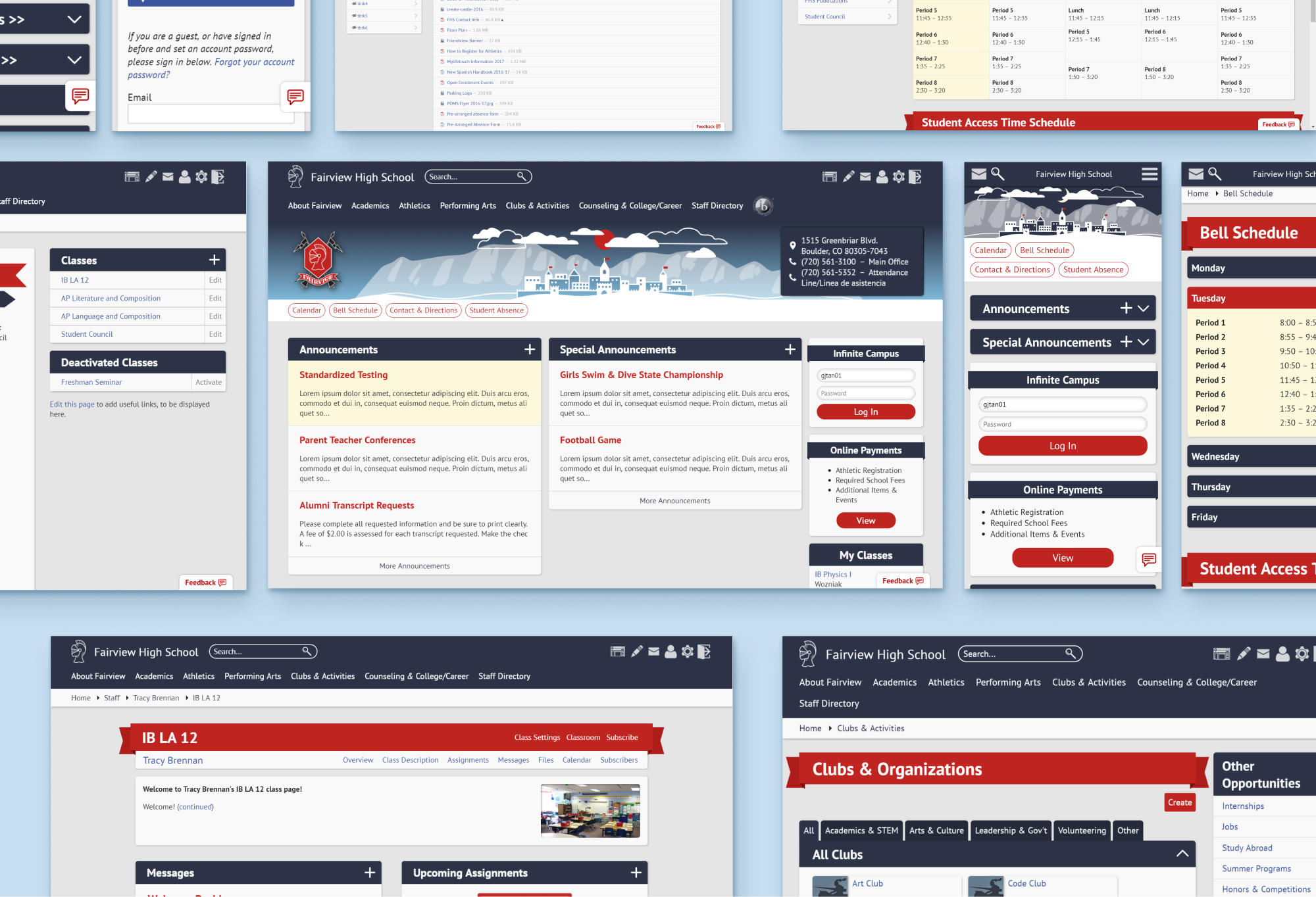
Changes and New Features
The following list details some of the updates but is not exhaustive:
- Corrections for existing glitches
- Revised visual design
- Slightly reorganized content
- Dual feed separates school-wide and extracurricular/class-specific announcements
- Collapsible/expandable announcements and information
- Functional content editing forms
- Separation of “Athletics & Activities” into “Athletics”, “Performing Arts”, and “Clubs and Opportunities” respectively
Future Plans
*All plans are subject to change.
Web Team currently plans to integrate the “Counseling, College, & Career” section with the rest of the website by separating the section into “Counseling” and “College” respectively. All content belonging to these sections will be redone using the new responsive styling. Along with the counseling integration, the team hopes to introduce a new graphical content editor to the site that will make it easier for staff and other editors to create and manage content.
Background and Rationale
About 30% of Fairview’s website usage occurs on mobile devices. The previous desktop layout was not designed to support the large variety of screen sizes currently available on the market. Web Team previously decided to mediate the issue by creating a separate “mobile site”. However, this mobile version lacked much of the information available on desktop and had to be updated separate from the desktop version during site modifications.
Ultimately, Web Team decided that the most sustainable solution was to replace both the desktop and mobile site views with a single device-agnostic design. We released the initial redesign (optional) in 2017 for beta testing.
As time has passed, we’ve made new adjustments to the redesign to address feedback from the community and ensure that the design can support the site as it continues to grow. We understand that we can’t please everyone, but Web Team sincerely hopes that our new release will serve the best interests of the community and the team’s future.